Garbage Design

Soft close goodness

Silent, soft-close necessity is the English way.
Pictured in the wild, before beautification, with cherry tree detritus.

In England, we have ‘Wheelie bins’. We do not have trash cans. Of course, we do not store the rubbish we've expelled from our homes into naked Wheelie bins, oh no. Our Wheelie bins (both general waste and recycling) live in little houses in the garden†. Wheelie bin Maisonettes, if you will. These accommodations are generally wood or metal in construction, front or back, depending on access by the collection men‡ and vehicles (both of whom we love dearly). Collections are typically fortnightly, if you were wondering. Wheelie bins were nationally ubiquitous roughly thirty years of our Lord, ago.

Love the bins, the plastic endurance, the sealed lid - amazing things that we take for granted and help keep the plague away. However, the Maisonettes they dwell in could do with some improvements. Notwithstanding the wooden structures that look fantastic for the first six months then fall apart, the metal variants are where my ire resides. Consider the photo above. You are looking at a Soft close doohicky. To spare the chagrin of a noisy close, these little pneumatic pegs will gently lower the metal lid to angular completion with nary a metallic reverberation. However, the pegs are a self-contained mechanism sitting in a metal housing and are prone to adhering lovingly to the lid thus, becoming wedded to the idea of departing from their homes entirely and rising with their lidular lover only to be spurned and ejected off into the garden undergrowth or worse, into the Wheelie bin itself.

Soft close goodness

Ikea-tastic soft-close peg and metallic housing

As you can see, the part that interfaces lovingly with the lid is plastic and the bit that sits in the metal housing is also, metal. This is hardly fair. The obvious result when lifting the lid to deposit waste is that the pegs will lift in convert and be mortally lost—every single time.

Soft close goodness

The lover's kiss of death

I'm not going to lie, I've spent entirely too much time pondering this puzzle. the peg cannot easily be glued to the housing owing to the fact that the surface area is vanishing small, metal, and that to do so successfully would require the housing itself to be glued to the outer metal structure. I feel this problem could have been anticipated during original design. Perhaps welding the pin to the housing to the structure. This was not the case and now, I must surreptitiously raise the lid like a ninja every time I wish to deposit lest I become dramatically less happy than the status quo maintains.

† Justifiable insofar it rains every other day and moss, mold and various lichens festoon every available surface.

‡ I have never, ever seen any other sex than male relievers.

~~~~~

Accepted Awfulness

Power combos

Sub-optimal key combos on a sub-optimal key arrangement.

I've been struggling along with QWERTY keyboards for decades at this point. I've reached a place where my brain has slowed to parity with my keystrokes. I've become numbly accepting of most of the general inefficiencies but irritation persists around the core non-linear text editing functions. The Z, X, C, V & A Command/Control key combinations are the most common interruptions to our laying down of purple prose we impose on ourselves yet, they're uncomfortable and incredibly error prone. I'm a freakish Lefty, so I have to move my hand away from the mouse and lift my elbow to chin height to accomplish the combos; we can't choose how we were born and my primary school custodians failed to tie my arm behind my back to gently coerce rightiness with a ruler. Every time I paste a pithy missive, I'm annoyed and amazed there isn't a better, easier, standardised method.

We all know the story behind the inefficient letter placement and staggered key arrangement but the origin of the power keys is quite interesting, even if possibly apocryphal. A little after Xerox PARC and a little into Apple, the cut, copy, pasta functions were arrived at by forcing them into the sequence of letters closest to the Command key. A for select all. Z looked like ‘forward → back → forward’ so, undo, redo type deal (now without the redo). X was delete, death, crossed bones. C for copy. V for.. (looks it up) upside-down caret, which was a symbol pointing up underneath text on '70s word processors. Bit of a stretch but OK. All sounds reasonable.

The problem however, is the frequency and duration we're all having to use these functions in the current era. Most of us spend the larger part of our waking lives feeling up our keyboards. A key combination for such fundamental functions seems nuts. There should be dedicated keys for this. God knows I've tried to map these ‘functions’, but it doesn't seem possible and even if it were, it would be a non-standard configuration which would only serve to confound us were we to need the use of another computer/keyboard. We can dream—imagine having dedicated keys arranged on the edge of the keyboard—or on the mouse. I've just now fat fingered ctrl + v, mistakes happen more often than we realise. The madness must end! Join my petition.

~~~~~

Holy God Phones are Terrible

Android control shade

Swiping down from the right side of an Android phone
to expose settings fails to display settings.

If you're in any doubt about how insanely complicated the little super computers we all have in our pockets are (and the 10+ devices in our junk drawers), and the insane a priori assumptions, consider the impossibility of feature discovery on your typical handset.

I wanted to reboot my Pixel phone because for some (software jank) reason, taking a photo with a focal point beyond the end of my nose, resulted in blur. I asked myself “self, how can I reboot this phone?”. I tried what all us hapless humans would try - I held down the power button. Of course, this didn't work. Instead, it launched some sort of ‘AI’ nonsense that no one wants or asked for. [Know that I'm going to rant about the force feeding of AI guff in a future post.] Hmm. Maybe the Reboot function lives in the Settings area/domain of the phone. I swiped down from the left side of the top of the phone's screen. Gmail: ‘Are you prepared for the coming apocalypse? Order with [food delivery service] now!’. Wrong side.

Swiping from the right side, I get the familiar control widgets pictured above. Only four though. Weird. Little did I know that swiping down for the second time would reveal (at the very bottom of the screen) the standard broken circle power icon that I was so fervently searching for. No matter, I found the Settings icon in the applications ‘tray’, accessible by swiping up from the bottom of the screen. Once in the app (I guess), there's a load of tappable (how is this not a word) sections and a search box at the top 'Search settings'. ‘reboot’ I typed. ‘Try searching in Tips & Support No results for reboot’ it replied. OK - what? I understand that these big tech firms have sold us always on sensors to Hoover up all our data but, come on. ‘power’. Power Menu ‘System > Gestures > Press and hold power button’. What the heck? I did that! Or did I? It turns out, I didn't hold the button down long enough. I needed to push through the distracting AI shenanigans and continue holding the button down to the point where I started vibrating with fatigue. Then, and only then, did it not work at all. In fact, I had to change the setting to favour power over AI. Good Christ. Finally, I rebooted the machine while throttling it in a basin of hot water.

After taking ages, it was pretending to be fully booted while still loading various apps à la Windows. Open the camera app, expect sharp distance photos. Not today buddy, wait for the bug fix. Hot God - how much of my life have I wasted? Imagine trying to explain all this over the phone to an aged family member.

~~~~~

Begrudging Design

Pre-vandalised bench

Pre-vandalised, exposed outdoor concrete platform that hopefully, people won't think to use.

Walk anywhere in any UK city centre and yeah that's right, keep walking matey. There's a conspicuously deliberate dearth of public seating; local government doesn't want anyone to have a reason to stop, rest or otherwise loiter. Occasionally however, the powers that be must slip fleshy masks over their saurian faces and pretend to provide a public convenience. Consider this 'bench'. It's a cold, sheer block of concrete with a portion removed from the underside to signal that it isn't a block of concrete.

The thing about the UK is that it's cold and wet most of the time. It also suffers from higher gravity. The only thing less inviting than lying face down on the frigid ground, half in a dirty puddle, is to perch on a backless, ice cold block of concrete. In terms of design, it's a triumph of Brutalist discomfort, realised intent and enduring economy, and simultaneously a disaster at the point of use. “What do you mean there's nowhere to sit, we've provided plenty of uncovered seating outside in the cold.”

~~~~~

Shear Staircase

Friendly handrail support

User-hostile staircase handrail support

Friendly handrail support closeup of the razor blade

Nicely angled away from your point of view. Glorious.

~~~~~

Cooking Instructions

I no longer have the best eyeballs in the world, I'm sorry. I can see things well enough to identify things and people, at least well enough to determine I don't like them. When it comes to teensy-weensy details, my brain software boots up and paints in a fantasy representation based on my experience. However, when it comes to instructions, it's important to know what the details actually are, rather than approximate what they might be saying. 'Connect the power feed to one of the sockets' isn't a winning strategy for knowledge transfer.

I'd like to think that there was a golden age of instructions, long since passed. An age where we truly cared to convey all the details in the most effective, usable and concise way possible. If ever suck a time existed, it's certainly over now. Consider the cooking instructions below.

Cooking instructions for people with laser eyes

Cooking instructions for people with laser eyes

This is the standard. Microfilm scale text in a light grey, printed somewhere hard to find on a package of food; typically there is much more space where the manufacturer could easily enlarge it. Presumably, they use HP inkjet printers where the micro-sized ink cartridges are only half filled which is then reduced by 10% by a completely necessary calibration print with swift, subsequent warnings at 20% remaining volume of any of the CMYK colour pots where a further 10% reduction of any of the four will disable the printer. I'm not bitter. If you wear glasses, which I now do, you're out of luck—you need to break out a magnifying glass or a macro mode on a smart phone to hope to see the relevant information.

What I find particularly odd about this is that poorly followed instructions may result in a sub-optimal result, perhaps the product is under-cooked, burnt, or otherwise not as the manufacturer would have preferred. This will result in a disappointed consumer, one who might not recommend the product to their friends, or may not purchase the product again. This, surely, is the worst outcome for the seller. This could well be the marketing people having too much sway on product design, hard selling the vendor on dubious consumer data and bogus focus group data. I'd be interested to know because the problem is ubiquitous.

~~~~~

Finger Workout

Coffee has turned into the saviour of the economy and simultaneously the perfect example of how the economy depends on the poor purchasing choices frequently made by the public at large. Given we're paying upwards of £3.50 for a cup of hot, dirty water, the purveyors have at least increased the portion sizes in a sort of pathetic concession to their exploitation of our desperation to always be doing or consuming something.

Coffee  cup with comically small handle

Comedy handle for bowl of hot, dirty water

I've long been annoyed by the ever enlargening cups - the handles are absurdly tiny. Quite often, I cannot get my finger into the loop and have to support the litre of coffee by pinching it. I can't use my other hand to help support the weight of course because the the non-handle surface area conducts heat better than a naked flame. Coffee in a cup rather than a mug has always struck me as a bit odd and at some coffee 'stores', they provide mugs if you spend more cash on a larger size. If you ask for a mug along with an order on the cheaper side, you'll find yourself on the end of a deranged, full-throated tirade turning the air blue - so don't do that. Exactly like how BMW deliberately ugly-up their lower models, you're punished in coffee shops with less ergonomic cups.

~~~~~

False Economy

I've lived with laptops for a fair amount of time and I keep them for many years so I'm wary of what to look for in terms of likely longevity. Having been stung by a terrible HP laptop where the screen literally fell off, the screen hinge is always of particular consideration. That was before the rise of 2-in-1 products where the screen can be folded all the way back to transform the a laptop into a really heavy tablet (no one ever does this) or to assume tent mode where you have the screen facing the opposite direction to the keyboard (no one ever does this either). When I first saw this, I thought given the intended function, we may at last get screen hinges that are robust and able to withstand the forces of normal use (clam shell) for years. So I've had a few.

Crappy laptop hinge

Crappy laptop hinge

Above is the hinge of an old Lenovo Yoga which to be fair, has lasted quite a number of years. I'd never used the 2-in-1 feature (like every other sane and reasonable person) but still opened the lid gingerly on all occasions because I have absolutely no faith that anything can withstand repeated wiggling. Additionally, I have absolutely no faith in manufacturers not cutting corners where they can and building in obsolescence where they can get away with it. As you can see, the metal hinge base on the left has ripped out the metal screw sleeves from the plastic frame. Below those sockets you can see an intact screw point with the sleeve embedded like a little cog providing some resistance to rotational force and to vertical stress - there's a little bit of diagonal shape to the gear-like sleeves as you can see below.

Crappy laptop screws

Crappy laptop screws

The robust metal hinge is secured into a plastic base. The hinge on the other side of the laptop is fine and differs by having part of the motherboard covering it, which could be the reason for it's continued faithful service. When I removed the rear case, I was completely expecting all this of course but I was disappointed to see that there really isn't any extra beef on these more sophisticated 2-in-1 hinge assemblies and that if I were an avid user of the feature (which no one is), the hinge would have likely failed years prior. I've super-glued the sleeves back into place but my hopes aren't high. I'll probably have to hurl the device onto the mountain of e-waste and endorse more emissions by buying another.

~~~~~

The Candy Bar Problem

It is literally a daily frustration getting at packaged food. Small, individually wrapped foodstuffs are typically quite tightly wrapped in plastic. When this is the case, the manufacturer will attempt to make it possible to unwrap with fingers alone by having part of the plastic projecting beyond the contents with the promise that the seal can be broken without having to damage the grub. Most often, this takes the form of a ‘serrated’ edge, implying that the plastic can be torn through a divot. This is almost never the case.

A daily frustration.

The horizontal vertical problem.

Take this packet of crackers. It's a long rectangular, crinkly bag full of crumbly crumbs. Before touching it, you, I, anyone knows how it's going to go. I wrestled with the serrated edge, trying to rip it open and failing. I then performed the there must be a lateral tab, partial incision, perforation, string (like a Band-aid, no wait, that's not likely) dance, searching about for an easier way in only to be (predictably) disappointed. This is the Candy Bar Problem.

I return to the end and eventually rip a hole lengthwise, just large enough to let out some crumbs but too small to free a cracker. I now know what to do. I need to rip the sharp end of the hole laterally. This will happen extremely quickly, will bisect the package and will result in one or to crackers falling to the floor, along with a spurt of profanity. Why is it we're all but instructed to rip in the wrong direction? You only have to imagine the ideal scenario - rip across the middle of the first cracker in one quick, deft stroke, completely removing the plastic cap and revealing the first segment of yummy food ready for the plucking.

~~~~~

Pilot Greenwash Pen

Companies wanting to appear environmentally friendly is all the rage, particularly given how they are largely attributable for the destruction of the planet in their wanton pursuit of profit. I had no idea Pilot, the pen people, were at the cutting edge of rank greenwashery. I bought a few dry erase whiteboard pens from Pilot in the assumption that they were of higher quality - some of my favourite pens have been Pilot - who doesn't love the V5 range of fine liquid rollers. Indeed, they work well but alas, the ink reservoir doesn't seem to be the most generous. Upon examining one that had run out, I noticed a warranty-like sticker on the end 'Do not remove except when replacing refill'. Turns out, the plastic wrapped plastic bottom comes off to reveal an inner plastic reservoir with another sticker 'Do not remove the cartridge with ink remaining'. It is this Matryoshka doll of plastic that enables the 0.5ml of ink to be refilled with separately purchasable 0.5ml containers. [I can't find details on exactly what the volume of ink is.]

A pen that's mostly plastic.

Pilot Board Master dry erase pen that has plastic where ink should be.

All things considered, it seems a bit of a greenwashing exercise. Visiting their Begreen range of recycled products, they seem very proud of their efforts: 'Preserving the environment is a major challenge that has long guided our acts and thinking' †. It sounds great but I have questions. The small amount of ink in the pens is a frustration, certainly there is plastic where ink should be. To refill the ink, I'd have to spend £10 on plastic wrapped, plastic containers with all the transport fuel that will be required. I think it would have been better to make the pens out of recycled plastics, make the ink reservoir comically large for the maximum longevity, then operate a recycling programme where the plastic can be reused. Less that this and it starts to smell like the printer ink scam.

† I couldn't select that text on the site. Grr.

~~~~~

Non-Expandable Boxes

A common frustration of mine is when confronted with a form or dialogue box on a computer application, the formatting of the constituent fields is such that for aesthetic or perceived space issues, they will have (or could contain) more content than they display, forcing scroll bars. An easy fix for this of course is to provide a means to increase the size of the text box or window, using one of the key benefits of a digital system. For web pages, unlike literal pages, content can flow vertically forever. Dialogue boxes can be full-screened if necessary. This is very often not the case however.

Windows, Linux Mint (Cinnamon), Salesforce non-expandable text boxes.

Windows, Linux Mint (Cinnamon), Salesforce non-expandable text boxes.

It's an absurdity to be constrained by a text box offering 4 lines of editable area when you very well may have a 4K monitor with acres of screen real estate to play with but for reasons only the design gods know, the sensible route is to take viewing control away from the user and disable in-built functionality. It's as if there are winnable points in user frustration.

Example of terrible Microsoft design in Windows

Microsoft design produced by drunk, blindfolded engineers with a grudge against the company.

Above is a typical example of how Microsoft handles heavily populated dialogue boxes displaying graphical contents - a tiny, non-expandable box. And no, clicking the Browse... button does not lead to an Explorer window where you can view all graphics in an expandable window oh no, just a list of DLLs with unhelpful names. [System32, do they not know we've left the '90s?] in short, you never really know whether you will be able to adjust a working or viewing space when offered, either by windows and dialogues or sites in browsers. I'm sure it might have been a design paradigm at one point in the distant past but the again, probably not.

~~~~~

Terrible Great Sauce

I've noticed a few trends in food packaging these days and I can't help being quite sceptical about them. Take for instance the squeezy sauce bottle. You'd be forgiven for thinking it's a cute design answering the consumer call for convenience of use with the literal flexibility of plastics. Rather than scooping out the creamy deliciousness from a jar with a spoon, you can just pop the hinged lid and squirt that tangy sauce directly onto your curly fries†, no spoon required. Nice. But there's a cost.

50% of the sauce will not leave this bottle.

50% of the sauce will not leave this bottle.

When you start getting towards the end, when the initial volume of product diminishes to say, 50%, it becomes increasingly hard to expel the sauce, you start fighting it, not dissimilar to the traditional toothpaste tube battle. No longer can you simply upend the bottle and gently squeeze out a perfectly laminar dose of sauce, you need to apply Herculean pressure like the reverse of a strong man ripping apart a telephone directory (or Harry Potter book for younger readers). You may again be forgiven for thinking this is a simple fact of physics and is in no way a feature - I disagree. We only need to put our 'what would capitalism want' hat on to see the benefits of this design for the manufacturers and retailers. Any foodstuff that's thrown away is a win. Ideally, man-tailers want you to purchase the products only to immediately throw them away, return to the store and buy more. This design does its utmost to frustrate any attempt to get at the remaining (50%) sauce. So, provided you're happy to sacrifice 50% of the product for the convenience of not having to wash up a spoon, this strategy will persist. I'm sure before long we'll jugs of milk fashioned in the same way.

† That initial squirt is typically 10%-20% of the contents as the aperture is so designed as to make a gentle squeeze ineffective and a firm squeeze a total deluge - there is no precision - by design.

~~~~~

One Strike Rule

There are a lot of things in life where a single upset to normal production permanently changes your view for the worse or kills it off entirely. Parachutes not opening, smart watches not lighting up when you've twisted your arm to check the time, brakes failing, fire extinguishers failing - to name but a few. Soaring above these examples is the technically genius technology that is under-screen fingerprint readers on mobile devices. It exemplifies the 'one strike rule'; if something fails once, it irreparably damages your confidence in it.

In the early days, you'd have to type or trace a code on a phone's touchscreen but in quick order, both Android and Apple evolved fingerprint readers on the phone body. Apple stuck with a button/reader combo on the bottom of the front of the device, not the greatest location - I'm sure Apple made a bit of additional revenue here - and Android had them all over the place, the greatest location being on the back where your index finger naturally rested. This was the pinnacle of authentication design. Most handsets presented the reader as a sunken button, easy to feel for which resulted in a perfect hit rate, provided your finger was clean and dry, no need for visual confirmation.

Photo of under-screen fingerprint reader

Photo of under-screen fingerprint reader as seen when out in daylight.

The ever present need for the new and novel pressed the designers into finding more sophisticated directions and the reader was soon moved under the touchscreen itself. [True of Android, Apple went for full 3D facial recognition which also qualifies as 'one strike'.] After a few iterations, it seems we've arrived at the final form, a small, optical or ultrasonic sensor somewhere near the bottom of the screen. Clever indeed but terrible for usability - you can't feel for the very small sensor region, you need to visually confirm the graphic indicator before pressing your greasy finger (or more often, thumb) onto the screen firmly before the system confirms the pattern and unlocks the screen. Seeing the target is particularly difficult in strong light e.g., outside during the day. A perfect example of achieving a satisfactory technological maturity and establishing a design paradigm only to frustrate the consumer by shuffling around the aisles and forcing an inferior solution just for the novelty. Sods.

~~~~~

Wonky Data Connectors

When I was a kid, the most sophisticated data connector I regularly had to tackle was the 9-pin serial ‘Control Port 1' on my Commodore 64 (joystick, naturally). Yes, it could only be plugged in one way to ensure physical matchup of the pins but at least it was on the side of the box, close at hand. Round the back, there was the A/V terminal which in my case, was a jack style ‘you can't possibly miss' RF to the telly. The mysterious, horseshoe shaped S-Video foreshadowing port went unused. The overriding memory I still have, when connecting up the kit fresh, was the massive gulf in friendliness between that joystick port and the RF. Little did I realise that my struggles with nefarious data plug design had only just begun.

The horror begins

Just before the digital video revolution, there was a clamouring for cleaner pictures on our blurry, jittery CRT tellies. Someone thought a new connector was in order - that person was French, and the new standard was SCART (all caps because it's shouting - in French). It is an initialism but no one knew what it was because it's in French. It was a clever technology, providing 21 pins for audio, video, weird control plane-like messaging, all kinds of geekery. I remember trying to stack VCRs using them in series, utter madness.

Bizarre SCART

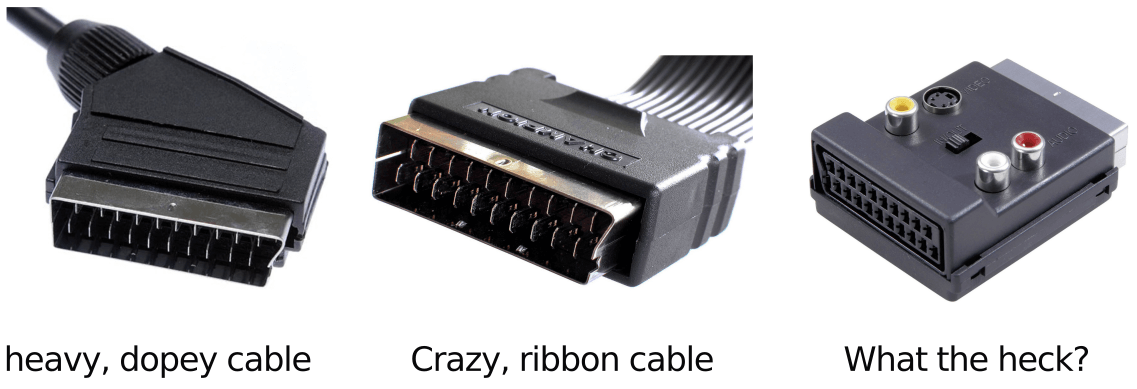
No matter how expensive the cable, SCART looks like a cheap, wobbly toothed hobo.

Most SCART cables had an angled connector off to the side which was weird because being a long thin rectangular mouth full of misaligned teeth, it was always incorporated sideways. This presented a few problems for the average use case. When you tried to plug in the connector, which invariably was behind a telly or VCR, it was nearly impossible to feel for the female receptacle as it was generally flush with the back of the device. Your angle of attack was angled owing to the cable, so it was tricky to get the connector to engage. Once you lucked out and dug the sharp end in, it was difficult to apply the right insertion force, typically resulting in a 'rocked out' angled seating which would effectively disengage the pins at the end which was bad because they were for video and ground and would result in strange symptoms that were hard to troubleshoot. If this problem wasn't extant from when you initially plugged it in, it would develop due to the weight and position of the cable. Truly terrible design, thank god it's dead.

Dear god we love the audio jack connector

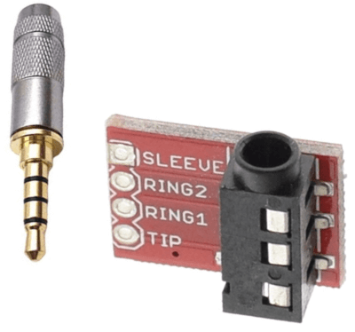
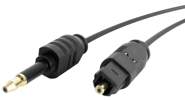
The venerable 'phone connector' type jack plug

A respite in sanity

Above is the classic jack plug that I hope to god we're still all familiar with. It's a radially symmetrical, rugged plug that you cannot possibly fail to fit in the hole. It's designed in such a way as to provide you with an audible and physical click when pushed home. This basic shape was invented for human operators to use when connecting telephone calls. As you can see, the 'pins' delivering various functions are 'rings' separated with insulating plastic. Given the rings needed to communicate along the cylinder, the number was limited by the girth which was in turn limited by the cost of material. in terms of usability however, it is an uncontroversial A*. The fact that they're still in use today despite being heavily threatened by digital software control by Big Tech, is a testament to how fantastic and enduring the design is. In fact, there was an evolution of the design, a jack plug with a hole in the end for a fibre optic cable - I kid you not.

The magical optical audio

The so very promising Mini-TOSLINK optical audio connector (ignore the one on the right).

The Mini-TOSLINK standard was a jack plug with the same dimensions as the 3.5mm audio plug but could deliver an unlimited amount of data depending on the material used for the optical fibre bit and the device transceivers in the connected devices. It honestly sounded like the solution - power and data delivery over a radially symmetrical plug. Where is it though? I've used it twice in my life for audio only. It is the answer, potentially super long cables with no degradation - similar to ethernet over singlemode fibre - a range of pricing and frustration free. It seems to have disappeared however. Ethernet is up there delivering 400Gbps of bandwidth and you're telling me HDMI is more capacious than TOSLINK? Something's gone wrong.

Speaking of wrong - HDMI. I'm going to skip over the equally asymmetric DVI and DisplayPort and talk about the truly awful High-Definition Multimedia Interface. This is an all singing, all dancing connector which is now the default standard for all displays and as ubiquitous on laptops as VGA used to be (ick). It's a fairly compact connector (with smaller variants) on a typically fat cable that is plugged into the rear of most devices. Harking back to the frustration of SCART, it's incredibly difficult to plug in - even when you know the orientation. In a darkened room and behind a telly, you're required to look at the connector in hand, push your head around the telly to check the location and orientation of the female receptacle, not see anything because everything is black - no effort made to highlight the socket of course - leave to get your glasses and a torch, confirm you are holding the plug in the correct attitude, attempt to plug in and fail even though you goddamn know you're right but are scuppered by the metal surround on the socket. Once it's in, you quickly forget all the pain. Don't get comfortable however, and put that remote down.

Holy Christ, not USB!

Yes, USB - you knew it was coming. This connector is the Pinhead of pain. The original conformation was USB-A, a plug that is externally symmetric but internally asymmetric. You can't tell whether you're going to be able to plug it in first time and hope to have a successful engagement the third time, which was of course was usually the case. As this is a small format designed for all digital computing accessories, you have to deal with it on a regular basis thus telescoping it's reach into your frustration centres to the point where you often feel the need to rage dump on colleagues, friends and loved ones. They never established a help line.

It was bad enough in the '90s living with this, ever since that cute blue iMac but invariably, the format would mutate and spawn new forms - amazingly - it got worse. Along came Mini and Micro USB. These were externally asymmetric but still worse as they were considerably smaller than USB-A. Micro USB is so tiny that even when you're looking directly at it in strong daylight sun, you're still not sure what the orientation is and you can forget looking at the female socket - she won't help you. After decades, along came the infinitely improved USB-C shape and standard. This offered the same usability as the now venerable Apple Lightning connector - small yet firm, relatively thin and manageable cables, and a reversible connector. Along with a greater power and data capacity, it was aiming to standardise the connector at both ends - no more asymmetric cables! A truly great end from completely unjustified means. Is it better than the phone jack plug? No. That bad boy is the Robocop data spike of connectory goodness.

Glossary for the young

  • HDMI High-Definition Multimedia Interface. They keep improving the spec and it doesn't seem like it's going to go away even though USB-C can do the same only better.
  • SCART A terrible data standard that's far too close to sounding rude. Stands for Syndicat des Constructeurs d'Appareils Radiorécepteurs et Téléviseurs - according to Wikipedia, which is news to me.
  • Telephone A device physically connected by wires to a network of wires that facilitated an audio conversation between the caller and the callee. Mobile phones have this function although wireless and rarely used.
  • TV Television. This was a broadcast of video content both pre-recorded and live, over radio transmitters to dedicated receivers (televisions). Content was shown on a schedule and typically not repeated. In order to 'catch' your favourite ‘show’ when not at home or otherwise near a television ‘set’, you could use a VCR to record it.
  • USB Universal Serial Bus. A god forsaken design by a team of sociopaths. An attempt was made to redeem themselves with USB-C.
  • VCR Video Cassette Recorder. We used to record TV shows for later viewing e.g., if the show was broadcast when we were out of the house. We would spend hours trying to fathom how to set a schedule on the VCR before giving up and randomly mashing all the buttons.

~~~~~

Copy Pasta (Web)

Back in the olden days, one of the great appeals of the internet was the simple ability of selecting a block of text, copying it to your computer's clipboard and pasting it into a text file for safekeeping (plagiarism). It was simple in that if you could see text, you could select it with the accuracy of a single character (provided you'd recently cleaned the dead dust bunnies from your mouse ball), and copy pasta. We took this for granted and it turns out, this was the pinnacle of human computer interaction. Of course, if the text was in an image, flashing too fast in a blink tag or scrolling by with a shambling cadence in a ticker, you'd have been out of luck but those were edge cases which were heavily telegraphed.

Fast forward thirty years of development, you have to fight every web site for its text, like you're trying to prise the one ring from Gollum's bony claw - and this is after the text stops moving around while the ads load in. Consider the bizarrely popular corporate SaaSy CRM - (godforsaken) Salesforce. It presents a metric ton of panes, sections, pop-ups, navigation rows, a bajillion fields - just everything you couldn't possibly want defacing your browser. Needless to say, the super special magic sauce that makes any modern web application just that much more professional and fantastic is a slimy, amorphous mass of client-side javascript crap slowing it all down - and Salesforce is the Blob. The great benefit of all this sludge is how brilliantly it makes selecting text a frustrating ragefest. Whether it's selecting your chosen text along with the entire page, point-blank preventing selection entirely, selecting link text only to have it load the target URL or triggering a pop-up when you click a word, you're guaranteed a whole bunch of un-productivity and time vampirism. I don't think I'm asking much, a simple rule: if you can see body text, you should be able to select it and copy it without feeling like you're being tripped up into a pit full of sharpened sticks - even if you're using a touchscreen (yuk).

We page copy fail

This is not an image.

Now that your heart rate has been quickened; your web page text selection is in your PC's clipboard, safely stored (god knows where). Here's where things get interesting - you've unknowingly copied style information along with the text. The default paste behaviour on most operating systems is to include this styling, for reasons.

Copying text from a typical web page

A bit of text that I want to copy from YouTube (I don't really, it's just an example).

Now that your heart rate has been quickened; your web page text selection is in your PC's clipboard, safely stored (god knows where). Here's where things get interesting. You've unknowingly copied style information along with the text. The default paste behaviour on most operating systems is to include this styling, for reasons.

Pasting the text along with style into Writer

The text pasted into LibreOffice Writer. It's there, look.

As you can see, a load of scaffolding has been pasted into a word processor and the text isn't visible, gah. 99 times out of 100, you don't want to grab the formatting along with text yet, for reasons only Steve Ballmer could possibly explain, the reverse function applies on most of the OS's I've used (all of them). Of course, there's the poorly advertised ‘just the text please, Eugene’ Ctrl + Shift + V method to wash off the crap but it's not always possible, particularly when pasting into SaaS applications. Alas, one of the most frequently used functions of basic computing frustrates us at both ends, most of the time.

~~~~~

1  ·  2