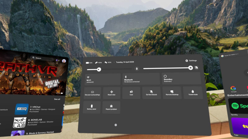
A bright and happy home screen on the Meta Quest
VR was teased in the early '90s. A simple concept: a display updates depending on the physical position of your head. Given sufficient technology, with the display stuck to your face, you can look around a virtual environment and, given the technology, interact with it. I was there 3,000 years ago, at the London Trocadero just off Picadilly Circus, where you could don massive plastic ‘Virtuality’ headsets (produced by Virtuality Group) and marvel at the 7 polygons on a shaky 3D landscape. The promise was set. ‘Hot God, I can do anything in a virtual world’ we thought to ourselves, aloud. The Lawnmower Man film came out and hot Christ, we were living the future.
During that time, Palmer Luckey was born, the founder of Oculus VR. Fast forward going on forty years (Jesus), Palmer and friends release the ‘Oculus Rift’ VR headset in 2013, nearly 15 years ago (Jesus). Using all the advances of mobile phone technology, the bulky, black, but not too heavy headset would plug into your (very powerful) PC, connect with a controller (Microsoft - boo!), external motion sensor, to display high resolution (for the time) stereoscopic video with an accelerometer reference frame. The games were mostly disappointing and derivative, the headset got uncomfortable quickly, using the hardware got tedious and physically frictitious super quick. At best, it was an interesting proof of concept, and a promise of what might come.
Fast forward a bit more time—a year or so, Facebook buys Oculus for a couple of billion. Luckey by name, lucky by nature*. The real life Wii/Mii avatar Mark Zuckerberg bets big on VR, even renaming the company to ‘Meta’ and investing many, many billions into the Metaverse. Billions. You'd be forgiven for thinking that the first original idea by Zuck would result in a good, low friction, shared VR experience. Headsets were refined into the relatively affordable ‘Quest’ line, a sprawling app store was connected up—Developers, Developers, Developers!
Beat Saber was a hit. Released in 2018, it's still the best game on the platform. What we have today is still a high friction experience with very few worth the hassle. The hardware is amazing, insofar the technology, but still uncomfortable and inconvenient—at least, uncomfortable given the available software.
The friction
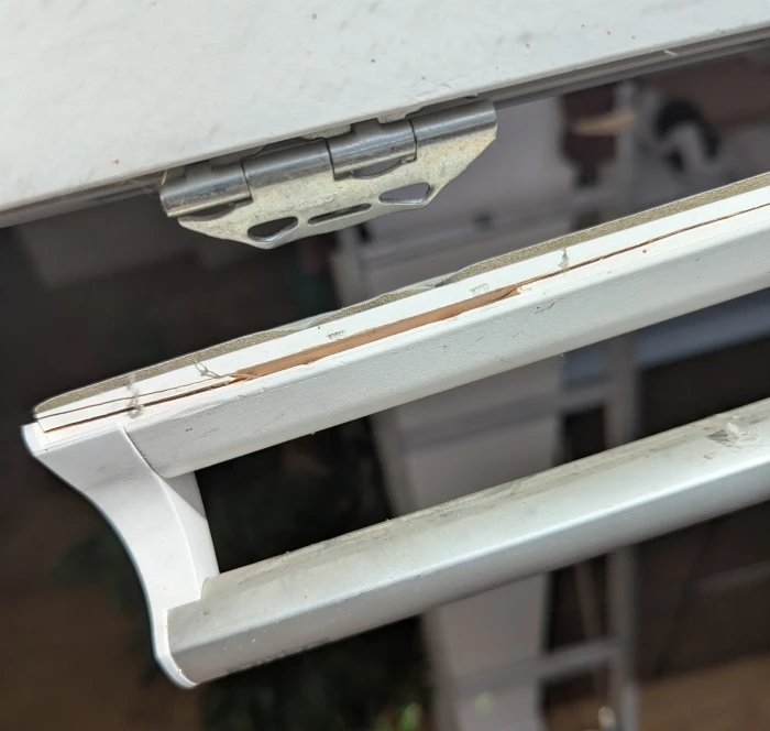
Wearing glasses takes some getting used to. Even if you wear specs every day and have worn them for most of your life, they can be quite annoying when perched on your nose, let alone all the nuisances when not near your face: damage, expense, loss, etc. Wearing a large, heavy, noisy pair of glasses which completely block your view (in the case of VR), or at best, pipe in a laggy, low definition video feed of the real world, takes a lot more getting used to. The state of the art is still very clunky and uncomfortable. Of course, as is our general experience with necessary or popular technology, things will get better—not that VR currently, is either of those things.
Some of the niggles that prompt the headset off your head and into a closet for a few years include:
- Authentication Logging in to anything is a major hassle these days. Passwords, passkeys, two factor, accounts, sub-accounts, migration, connected services—it's enough to make you flip the table on all our techno time vampirism and storm off into the woods. VR makes it harder because you can't easily read the scribbled note, credit card, phone screen when nagged by an app inside the headset. As it is, the 'pass-through' video still isn't quite good enough on any model. And there's a lot of authentication, believe it.
- Weight There are no light weight headsets. They all have what is effectively mobile phone giblets powered by the usual lithium battery. Cameras, speakers, displays, fans, batteries—it's not going to weight nothing. Yet. If all the tech can be packed into a pair of standard reading glasses or contact lenses or brain implants, then along with compelling software, it'll be a winner.
- GUI There are still no agreed conventions on how to interact with the software running on these devices. We don't know what to call the floaty thingies that aren't doing what we want or expect, much to frustrate our Googling.
- Boundary The headset needs to know where you are in space, your orientation, velocity etc. Similar to Satnav when you're setting off from a stationary position with immediate directional options, and you drive only to swear and u-turn, modern VR headsets frustrate you when confusing their location and position memory. It's a literal dance just to get into position before launching your software.
- Currency VR ‘ecosystems’ of course have the obligatory App Store where 3rd party developers can hawk their wares. To purchase applications, you may be able to tap in your credit card details on a floating keyboard or mobile app to make a purchase or, as would obviously be preferable by the platform owner, use ‘in platform’ or ‘in app’ tokens. [Which you buy with real money at a rate set by the owner.] Of course, it's a costly ball ache to subscribe to multiple platforms just as it is with streaming video services.
- Loneliness Wrapping your head with opaque tech is inherently a solitary pursuit, despite what avatars you may meet in the virtual world. Interacting with real people is still an audio affair. It's just not the same looking at a low-rez non-representational face.
- Applications They're mostly crap and unnecessary. The tech sounds like it offers a bonanza for amazing software but it's just not there. As I've said, the best VR app is still Beatsaber. I think the friction of the physicals is still too high and hampers all software.
- Cynicism People (a loose definition) like Zuckerberg have made their fortunes by siphoning data from users. We all know the deal with these ‘Tech Bros’ and their driving ambition to suck out our very souls for profit and control. The idea that they're convincing people to strap potentially brain reading devices onto our heads is more than a little worrying. What may end up preventing further refinement of the technology is the proven fact that firms want to know everything there is to know about us for commodity reasons.
We are where we are and the hardware is unfortunately, still quite cumbersome. However, the technology is quite amazing, if mostly on paper. Nowadays, the battery life is sufficient for the amount of time one can tolerate the wearing, and the visual fidelity good enough to engage in the content. This is where the main problem lies.
* Palmer Luckey claims he always wanted to build robotic super soldiers and is now concerned with ‘Turning Soldiers into Superheroes’ using VR augmentation technology, ‘If you die in the game, you die in real life’, he said portentously in a blog post.
~~~~~